Unit 16 Pyramid Games Brief
Logo: A symbol or other small design adopted by an organization to identify the products.
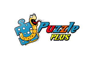
This logo its for gaming. The genre is fun and humorous. The logo has black outlines and it has different colours such as blue, red, and yellow this are primary colours also the orange is a secondary colour. It is like a cartoon style genre. On the logo it has puzzle piece and this is to show the audience that this game is age rating for children.

Although this looks like a logo it is what appears at the end of the game.
This logo has flat black background which makes the atmosphere scary. The skull and letters are grey and the letters look like they are melting. This is adding to the scary atmosphere. The skull has some large fang like teeth that suggests they might eat you or are vampires.
It has skull in the middle of the design and text beneath. The design looks balanced overall because there are four letters either side of the skull.
There is fire (little bits of flame) coming from the top of the letters to look like the letters are burning. It makes the logo scary.

There are two ducks and one dog. The outlines and colours made the ducks and
dog look like a cartoon and animated. The logo has green background, which came
it colourful such as red, grey, black and white made the logo fun. The logo has
red outlines. The text is on the middle and bottom of the design. On the logo
it has a red background behind the dog because the background is green and the
dog’s body covered by green so therefore this makes the body of the dog appear
The background of this logo is black. The colours of the
text at the bottom are orange and brown and the outline is black. Also the text
at the top is white and the outline is blue. In the middle behind the text
there is a sheep, which the main character of the game also behind the sheep it
has pink buttons and wings.
The
colours are pink and golden colours. The background is brown and it made the
text standout.
The text has black outline also it has diamond shining in
the middle of the text. The diamond makes the logo looks like adventure game.
The text is bold and it has white colours and black outline.
The background is green and it goes with the white colours. Also at the bottom
of text, it has small text and the background for that is black also
this makes it standout, that’s why we can see the small text.
The backgrounds are old golden, brown and white colours. The
colours of the text on the top are black and in the bottom are red. The text
looks more like funky and bold. The overkill is in red and this suggests danger and blood. The text does not look neat and is wonky or aligned properly. This impression is disturbing.
Using Photoshop you can create the look of the lettersby rubbing away part of the colour using a eraser tool. To make the type look wobbly you can used the transform tool to rotate the letters a little bit.
The logo of this game it has no background colours but it
has leaves has a background because the game it’s about playing with different animal
in the zoo. The text it’s big and bold, the colours is yellow also it has brown
outline and inside.
The background is red and blue. In the middle of the design
there is male running holding basketball and no added colours just plain white.
The text on the left hand side on the bottom the colours are white and its bold
it standout.
The
text colours are green, golden and orange. The text looks like it’s getting
bigger and it’s about to pop. On the letter M has horns, eye and long tail around the text in the bottom. Also
by this the logo it’s all about monsters looks.


